ClosedLoop recently published the COVID-19 Vulnerability Index, an open-source tool for predicting vulnerability to complications arising from the COVID-19 virus. In this post, we cover the question “why is a C-19 Index important?”
Written by Joseph Gartner, Director of Data Science, ClosedLoop
Originally published March 27, 2020. Last updated June 19, 2023. • 5 min read
ClosedLoop has recently published the COVID-19 Vulnerability Index (C-19 Index), an open-source tool for predicting vulnerability to complications arising from the COVID-19 virus. In my last post, I discussed a lot of the “what” questions surrounding the model. If you haven’t read that one, you might want to read it first to get an understanding of what the C-19 Index is, how it was made, and how the model performs. In this post, I’d like to turn my attention to another important question, “Why is a C-19 Index important?”
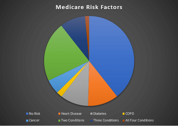
Figure 1 — Percentages of the medicare population that are effected by various CDC risk factors.
The C-19 index expresses risk for an individual to have a complication from COVID-19 as a probability. When I say a complication, I generally mean something that would force the person to go to the hospital, and put additional stress on the system. The primary reason this is so important is that the potentially susceptible population is quite large, as is the number of people having a complicating risk factor as described in Figure 1. My colleague, Carol McCall, wrote an excellent article detailing how well planned intervention strategies are a key factor in mitigating the worst effects of COVID-19. For many, it’s a challenge to understand how having a risk probability is more useful than the CDC general guidelines. By having a more precise estimation of a person’s risk, we can prioritize outreach to those who most need it.
Combating Scarcity
The Washington Post has produced an excellent visualization of the spread of the disease under varying levels of interpersonal contact. However, that visual tells an incomplete story. In the Post’s model, everyone who catches COVID-19 gets better. It is an unfortunate fact of the matter, some people who contract COVID-19 will perish. Others will need resources that our hospitals can provide; assuming the hospital systems are not overburdened. Let’s let the following diagram represent a population of adults over the age of 40:
Figure 2 – A visualization of the population. Some individuals, if infected will need hospitalization (red). Some individuals will not (blue). We do not know if a person will need hospitalization unless they become infected.
As the label suggests, red dots are individuals who, if infected, will need to be hospitalized based on complication from COVID-19. Blue dots represent those who will combat the infection without needing hospitalization. While it is still important that we all contribute to efforts to combat the spread of COVID-19, it’s possible for us to enact interventions to help further isolate specifically those folks who are at risk. The difficulty is identifying those who will become infected to target them for interventions. One way of doing so would be to follow the general guidelines coming from the CDC:
Figure 3 – The medicare population, segmented by the CDC guidelines.
If we look at the Medicare population, the CDC guidelines apply to over half of those individuals. In our representation, these guidelines will identify those individuals who would eventually need hospitalization. The issue is, without a more granular approach, targeting inside this group is still done randomly within this population. Without further granularity, drawing from people within this target group would look like the following:
Figure 4 – A visual representation of an intervention schedule from randomly drawing within the “CDC at risk” group.
We can see, in a week of interventions, many individuals who would have been hospitalized receive an intervention that potentially keeps them safe. Still, many individuals who would not eventually be hospitalized are targeted for interventions as well. Increasing the number of red dots in this chart means fewer people in the hospital.
Using the C-19 Index
The C-19 Index allows us to further assess risk by drawing upon past experience of looking at how interacting complications and age combine. Instead of a hard boundary, we now attach a risk probability:
Figure 5 – Assigning probabilities to who will be effected. Here, dot size is the probability of hospitalization the model assigns to an individual.
Here, the size of an individual dot corresponds to the predicted probability of having a complication. The real effect can be seen if we look at an intervention schedule driven by such prioritization.
Figure 6 – Intervention schedule based on probabilities.
The effect is subtle, but there are seven more individuals who would need hospitalization that are contacted in this scenario. This corresponds to a 29% increase in the number of effective interventions. Using the CV19 Index means that more energy and effort are expended on individuals who will eventually be hospitalized because of COVID-19. This directly leads to less hospitalizations and deaths.
Extrapolation
The above visualizations were made in an attempt to illustrate the underlying issue of why a granular, data-driven model should be used as a part of an effective intervention strategy for combating COVID-19. The question becomes, what will the eventual impact be? While it’s impossible to know for sure, if we make some assumptions, we can make a good estimate. We’ll assume that we’re applying this data to the Medicare population of an HMO with 250,000 Medicare-eligible members. We’ll also assume that any intervention would be 50% effective, and that within this population, and the prevalence of COVID related hospitalizations are 10%. We can then compare how we would do over time using the C-19 Index vs. randomly sampling using the CDC guidelines.
Figure 7 – Extrapolation of successful interventions based on two strategies for identifying COVID-19 risk.
The above image shows projections for the number of successful interventions over the course of a 3-week period. If interventions are concentrated more heavily on those who will eventually have complications, we can decrease the load that hospitals encounter. These reductions will directly translate to saving people’s lives.
Interested in reading more about our response to COVID-19 and the opportunity for AI to help alleviate some of the burden caused by the pandemic? Check out these posts:
Artificial intelligence (AI) and machine learning (ML) are increasingly used in healthcare to combat unsustainable spending and produce better outcome...
COVID-19 simultaneously exacerbated existing health disparities and introduced entirely new ones. The pandemic disproportionately impacted people of c...
11 min read
Make AI/ML a core element of your care strategy.
Get in touch today to see the ClosedLoop platform in action.